So I’ve finished creating and uploading the list header images. Here they are!

DC Universe – For this one, the choice was obvious. It’s the DC Logo in a starry sky. I don’t know what could say “DC Universe” better than that.

Recommended Reading Order – I wanted to imply that this is the path you should follow, so who better to lead the way than Destiny of the Endless (featured so heavily in Sandman)

Split Crisis Reading Order – For this one I split the icon down the middle and included a Pre-Crisis and Post-Crisis Batman. I was going to go for more contrast in the costumes, but I ended up deciding on similar costume but totally different personality and drawing style. I think it serves the purpose rather well.

Chronological Reading Order – I was going to go for the Time Trapper with an hour glass but I couldn’t find any images good enough. I then remembered this one of Superboy breaking the time barrier (I think he’s going to stop Abe Lincoln from being assassinated, or something.) Had to clean out some text and extend the colors.

Pre-Crisis – For this era I decided to go with one of my favorite stories from the Silver Age, where the Justice League of America is fighting their evil counterparts on yet another parallel earth. I thought it showed the aesthetics and themes (as well as why the crisis happened) all in one image. This one didn’t take much editing, just fixing an awkward crop on Power Ring‘s glove.

Post-Crisis – I thought this image of the early Post-Crisis Justice League (plus non-main book members) was a great one for this list. A lot of people felt that the DCU was immediately a darker place, but there was a lot of fun going on as well – it was still a world for heroes! The image also shows how many of the characters from various earths were now co-existing on one Earth. And I just like the drawing. It was a really hard choice, seeing as there have been so many smaller periods and trends since Crisis on Infinite Earths. Since I wasn’t using it as the Justice League header, though, I took out the text on the top.

Golden Age – While I technically don’t have a lot of Golden Age stuff up yet, and it’s mostly just the Superman and Batman Chronicles books, I still thought this picture of the first meeting of the Justice Society of America exemplified what the Golden Age was all about – lots of quirky and colorful heroes and an era of firsts. Plus, just look at The Spectre there. Pure gold. I took the text off the table though, it just looked weird (and didn’t fit for this header, maybe for their own.)

Silver Age – I mention that I think the DC Silver Age started with the success of sci-fi anthology Strange Adventures, but the Barry Allen Flash was still the icon of this era. It only makes sense that his first appearance in Showcase Presents would be the picture for this list. I extended the orange on the left and took out the title text, so hopefully it doesn’t look too funky.

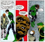
Bronze Age – I just couldn’t resist using this “My Ward Is A Junkie!” cover from Green Lantern / Green Arrow. Not only is it kinda hilarious, it’s from a totally classic title that helped start and define the era. I had to take out a bunch of text and extend the lines to get it to work, but it came out fine.

Modern Age – I had a lot of trouble with this one. I started by looking at images from The Dark Knight Returns or Batman: Year One, since I felt they both set the tone for much of the Modern Age, but like Post-Crisis (which is basically the same thing as this, actually) there are so many different directions one could look in for modern DC Comics. I ended up wanting to focus on the reboots of the big three (Superman, Batman, and Wonder Woman) and from there I just remembered this image by Frank Quietly which works quite nicely as a small image. Since this was the cover of JLA: Earth-2, I had to take the title text out above their heads.

Vertigo Universe – This one was easy. I consider Swamp Thing to be the seed (plant joke) of the Vertigo Universe, so he was a natural choice for the Vertigo header. I extended the green background a bit to the left there, but besides that this image (from the cover of the first Swamp Thing volume, Dark Genesis, I think) worked very well. On a side note, I put up Swampy’s header image while I was doing this.

Wildstorm Universe – I don’t have much in the way of Wildstorm up online yet, but it’s got its own category, so it deserves an image. This one of Midnighter having tea while some kind of end of the world goes on in the background panels seemed fitting enough. The background was way too distracting, though, so I darkened and desaturated it and brought him up a bit in lightness and contrast. Looks good, I think.
That’s it for the List headers!
While I’m at it, I also put up images for JLA and Justice League (technically list the same books, just there because people search for the titles differently while using the database, so I put up two different images just for fun), Batman and Joker.
I try to have a little fun with these to make browsing more enjoyable. Hope you like em!