I really don’t have a whole lot to say this month to kick off the new edition of Lee’s Pull List. I know, I know – I’m shocked, too. It’s my birthday in a couple weeks so I’m hoping for some new trades. And that’s really all I can think about. That and Star Trek, but that’s neither here nor there. So, yeah…Disclaimer Time!! All titles are paperback unless otherwise noted and the suggested retail price is just that: suggested. All of the dates are approximate and subject to change so you should always check with your local comic shop before planning your purchase.
Without further ado, (I got it right on the first try this time, Gorby!), and absolutely no fanfare we begin!
MARVEL

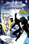
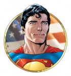
There are 11 different Wolverine books scheduled to come out this month. Which means almost half of what Marvel is putting out into the world of trade paperbacks feature the adamantium clawed, cigar chomping, beer swilling, indestructible mutant, Logan. That’s even more then what they put out two months ago when billionaire playboy Tony Stark made his return to celluloid exploits. It feels a little bit like overkill to me, but what do I know? Anywho, I picked this book out of the throng for literally no other reason then it was the first one I saw and it directly ties in to the new movie. It’s a collection of stories that tell Logan’s origins with the Weapon X project, shed some light on his Japanese love interest and her evil father, (why can’t they just have a well adjusted home for once?), and features members of S.H.I.E.L.D. and the Amazing Spider-Man, who, I’m assuming, won’t be in the new movie. Most of the hardcores will all ready have this, but if you’re one of the five people who don’t know anything about Wolverine then I guess go buy this book!
SRP: 19.99
Contains: X-Men Origins: Wolverine #1, Uncanny X-Men (1st series) #118-119, Wolverine (1st series) #1-2, #83-85
Amazon, Indigo: June 25, 2013
TFAW, MCS: June 12, 2013

HULK: FROM THE MARVEL UK VAULTS
Ok, Marvel redeems its shame less capitalizing with this book. Apparently most of these stories have never been seen by American eyes before. They’re from 1979, and, I would assume, onward and they’re taken from the weekly Hulk Comic that was created around the time the live action series was gaining popularity. There’s some big names involved, including Dave Gibbons and Steve Dillon, and it should be interesting to see what a British take on the Hulk is like.
SRP: 34.99
Contains: Unsure, but at least 296 pages of Hulk and Crumpets awesomeness
Amazon, Indigo: July 9, 2013
TFAW, MCS: June 26, 2013

CASTLE: CALM BEFORE THE STORM (HC)
When I first saw a Castle comic book I kind of chuckled, showed a friend who also thought it was funny and then moved on. But these things keep popping up. Based on the TV series starring Nathan Fillion, (the only reason to watch it), these are stories written by the fictional Richard Castle that would be talked about in the show. I’m assuming part of his Derrick Storm series. It’s kind of meta, but kind of cool, too. And apparently it’s popular because they keep putting them out.
SRP: 19.99
Contains: Castle: A Calm Before The Storm #1-5
Amazon, Indigo: July 9, 2013
TFAW, MCS: June 26, 2013
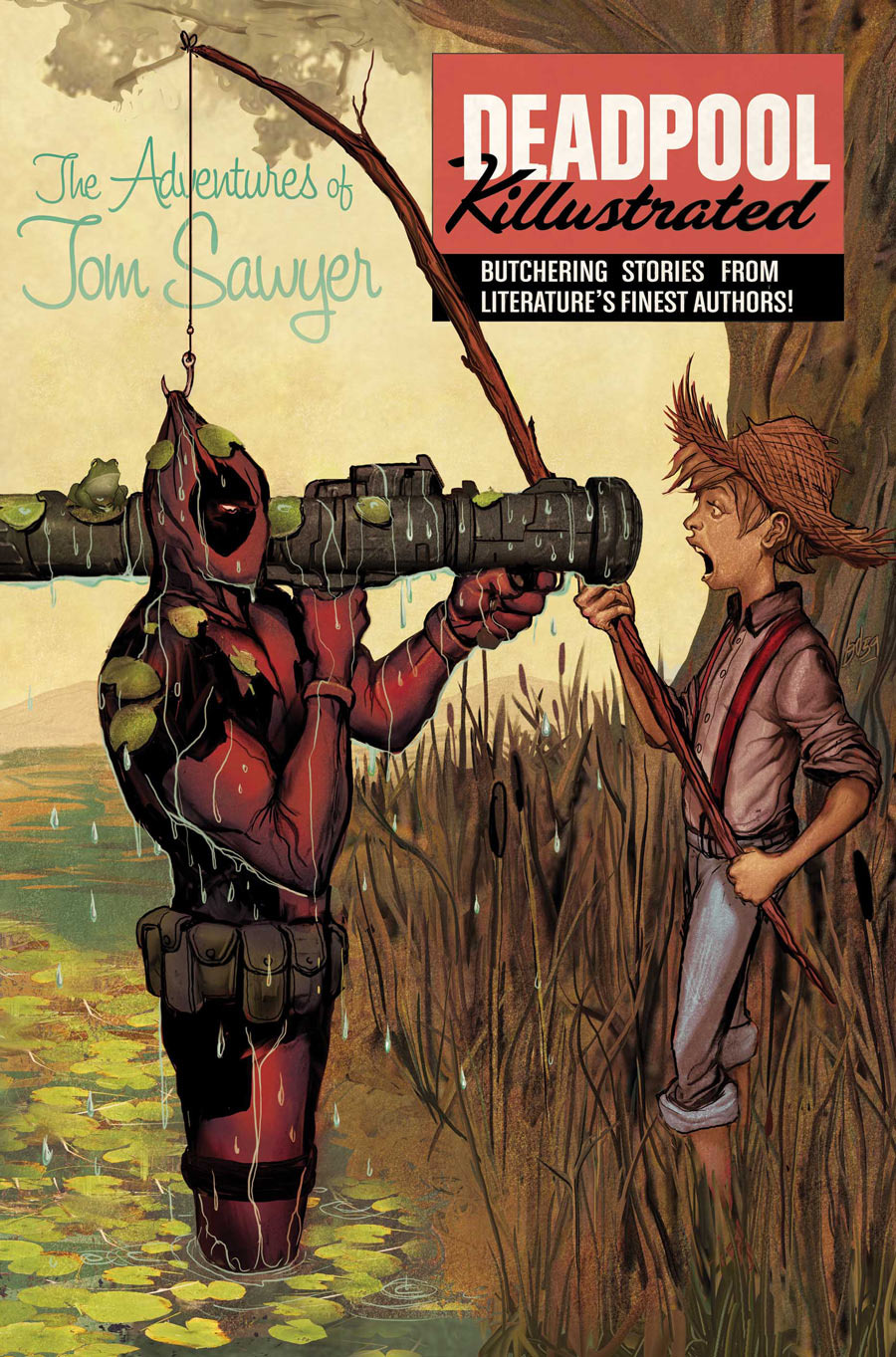
This, very clearly, is not going to be canon as far as the continuing saga of Deadpool is concerned. If you have to read everything the Merc with the Mouth is in, though you’re going to get this regardless. As for what the book is about…well, try this on for size. Killing the marvel universe wasn’t enough because Deadpool is gunning for major literary characters now. Tom Sawyer, Little Women, Scrooge, Gulliver, Sherlock Holmes and more are sliced, diced, shot, stabbed and maimed all for our sick pleasure. Like I said, I don’t think this is canon by any means, but it could be fun and we all need a little fun sometimes.
SRP: 14.99
Contains: Deadpool Killustrated #1-4
Amazon, Indigo: June 25, 2013
TFAW, MCS: June 12, 2013
DC
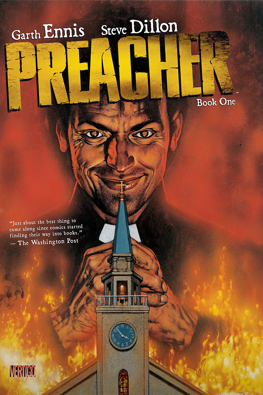
Speaking of Steve Dillon…I love these books. Maybe the end of the series gets a little muddled and some of the one-offs and last third of the series kind of feels like it’s padding out what I’m sure was a lucrative run, but for sheer, balls-to-the-wall creativity and jaw-dropping fun this series is the go to destination. Anyone who owns volumes 1 through 9 probably don’t need to bother, but anyone who doesn’t should take note as each book contains roughly two volumes at a discounted price. There’s really not a whole lot that needs to be said about this other then: go and get it! Seriously! It’s fantastic!
SRP: 19.99 (crazy considering each volume was released at roughly this price point)
Contains: Preacher #1-12
Amazon, Indigo: June 18 (my birthday! how appropriate!)
TFAW, MCS: June 12

At first I thought this was new Harley Quinn stuff, like New 52 new, (sheesh!), but it is not. This is the second volume of Harley’s solo adventures to be collected in trade format. The first volume was released…six years ago?! What the what?! How is there not more Harley love going around? And why did it take six years to continue collecting these issues? It’s written by Karl Kesel, too, so I’m sure it’ll be entertaining. This contains two arcs, one where Harley decides to go good, (long before her Gotham City Siren days), and the other has her battling Croc. I don’t know, I’m intrigued.
SRP: 16.99
Contains: Harley Quinn #8-13, Harley Quinn: Our Worlds At War #1
Amazon, Indigo: June 11
TFAW, MCS: June 5

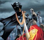
Batman And Robin Vol. 2: Pearl (HC)
New 52 Batman and Robin adventures, featuring Damien Wayne as Robin. I don’t need to say much about Batman and Robin. You either like it or you don’t. I do. I mentioned last month how I liked the idea of releasing two volumes simultaneously and I stand by that. Vol. 1: Born To Kill hits stands the same day in paperback format. DC is also releasing two volumes of Stormwatch and two volumes of new Superman shenanigans. Dig it.
SRP: 24.99
Contains: Batman And Robin (2nd series) #9-14, 0
Amazon, Indigo: June 11
TFAW, MCS: June 5
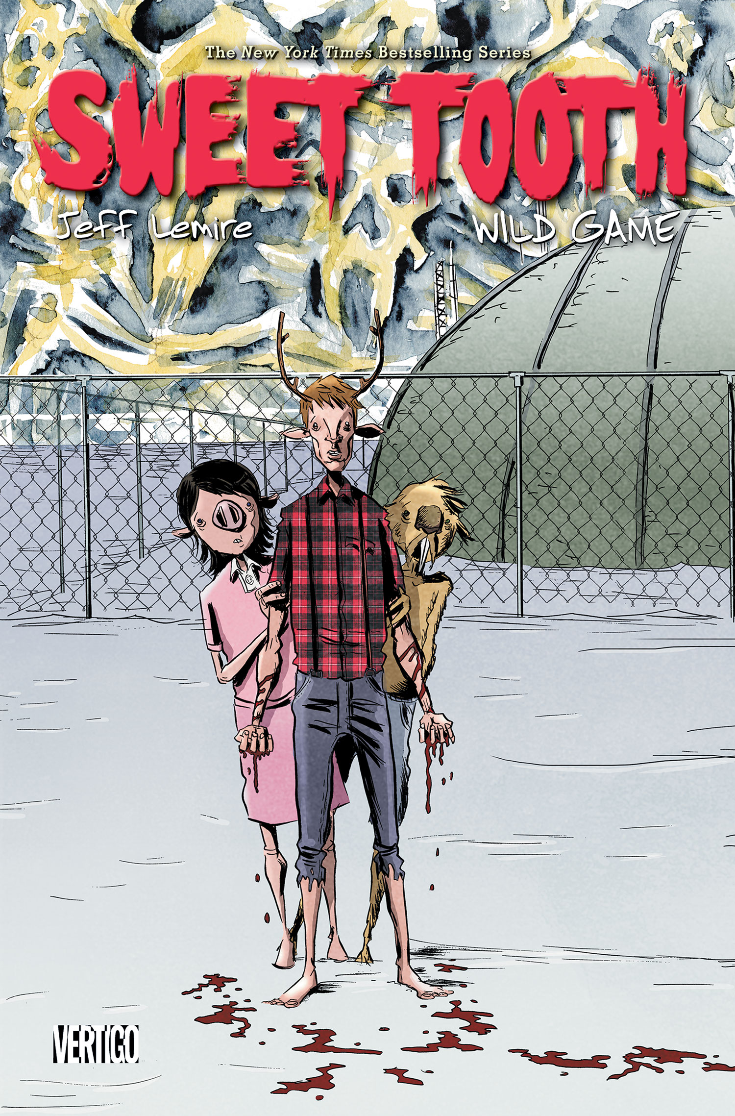
For some reason I thought Sweet Tooth was done after Vol. 5. I’m glad I was wrong. I’ve only read the first Volume, but I quite enjoyed it. On paper it sounds kind of ho-hum: post-apocalyptic world, boy who kind of looks like a deer so I started thinking like Road Warrior meets A Boy And His Dog, but it’s really much better then that. Anyone who’s familiar with Jeff Lemire probably all ready knows about Sweet Tooth and his, well, sweet tooth. Anyone who isn’t should start at Vol. 1 or read his fantastic Essex County series. The guys really good at getting genuine emotion, humor and a decent helping of action and making all of it feel totally right.
SRP: 16.99
Contains: Sweet Tooth #33-40
Amazon, Indigo: June 25
TFAW, MCS: June 19 (the day after my birthday! how appro-ok, i’ll stop)
INDIES
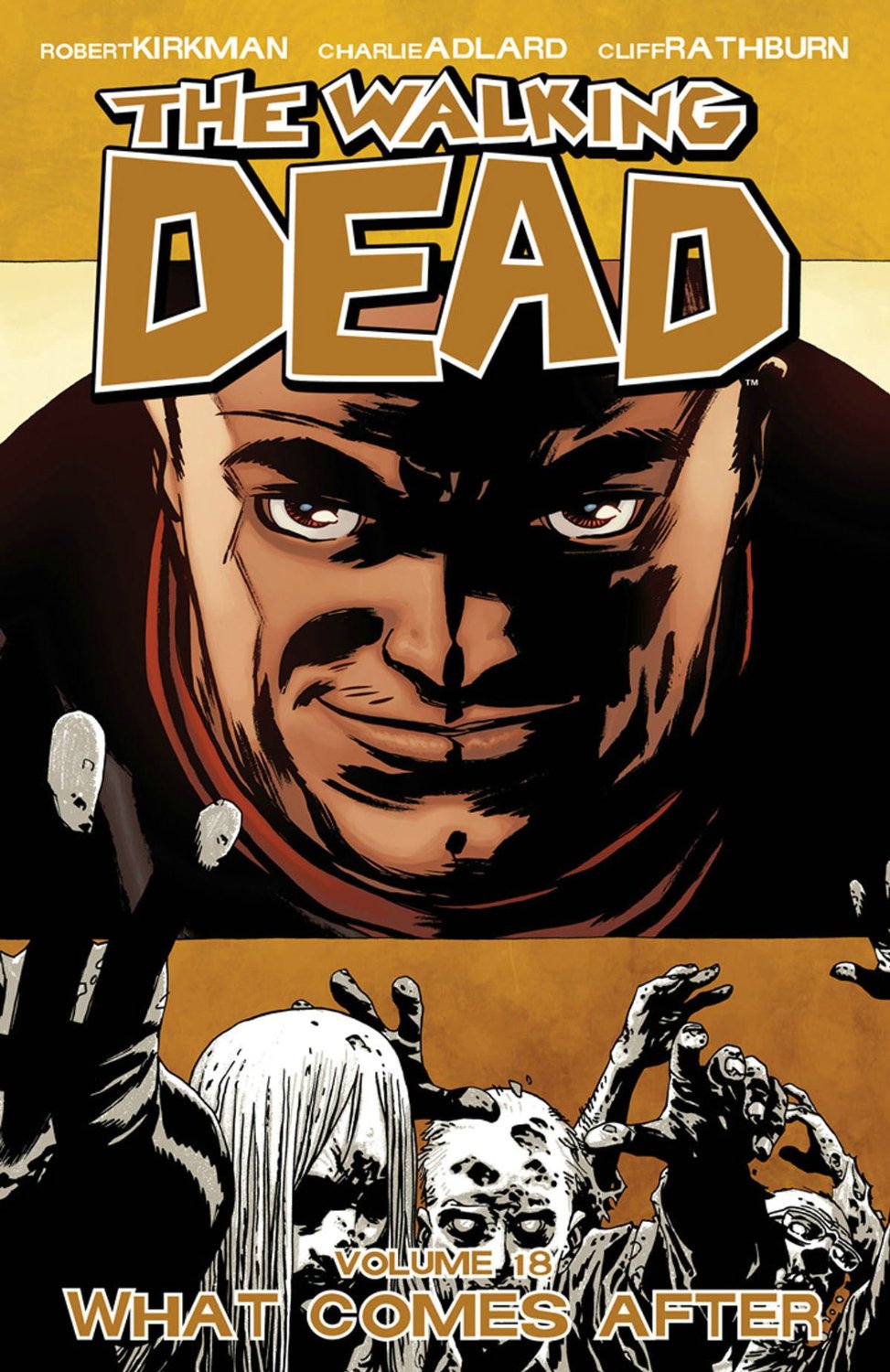
THE WALKING DEAD VOL. 18: WHAT COMES AFTER
Oh Negan, what have you gotten yourself in to…? For those of us who wait for the trades we’ll finally get to see what Rick and Jesus have planned for the baseball bat wielding, soliloquy spouting tough guy. I really don’t have a whole lot to say about this other then I LOVE IT! Hands down one of my favorite ongoing series of all time.
Publisher: Image
SRP: 14.99
Contains: The Walking Dead #103-108
Amazon, Indigo: June 7
TFAW, MCS: June 5
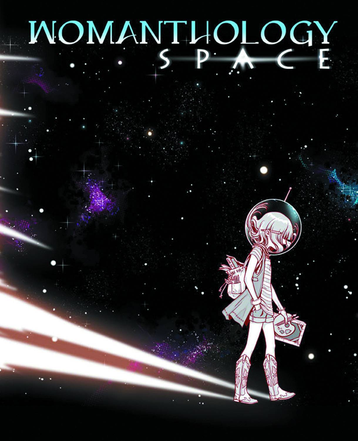
I was going to write about this last month, but it was slightly delayed. This is a collection of sketches, stories, poems, anecdotes and pretty much everything in between and around the comics medium all written by women. That might not sound like a big deal but in the boys club that is the comic book world it’s kind of cool to see a female perspective. The first volume of this series revolved around the word Heroic and, like this volume, profits from the book go to charity. This is sweet. Get on it.
Publisher: IDW
SRP: 24.99
Contains: 128 pages of estrogen laced Space
Amazon, Indigo: June 7
TFAW, MCS: June 5
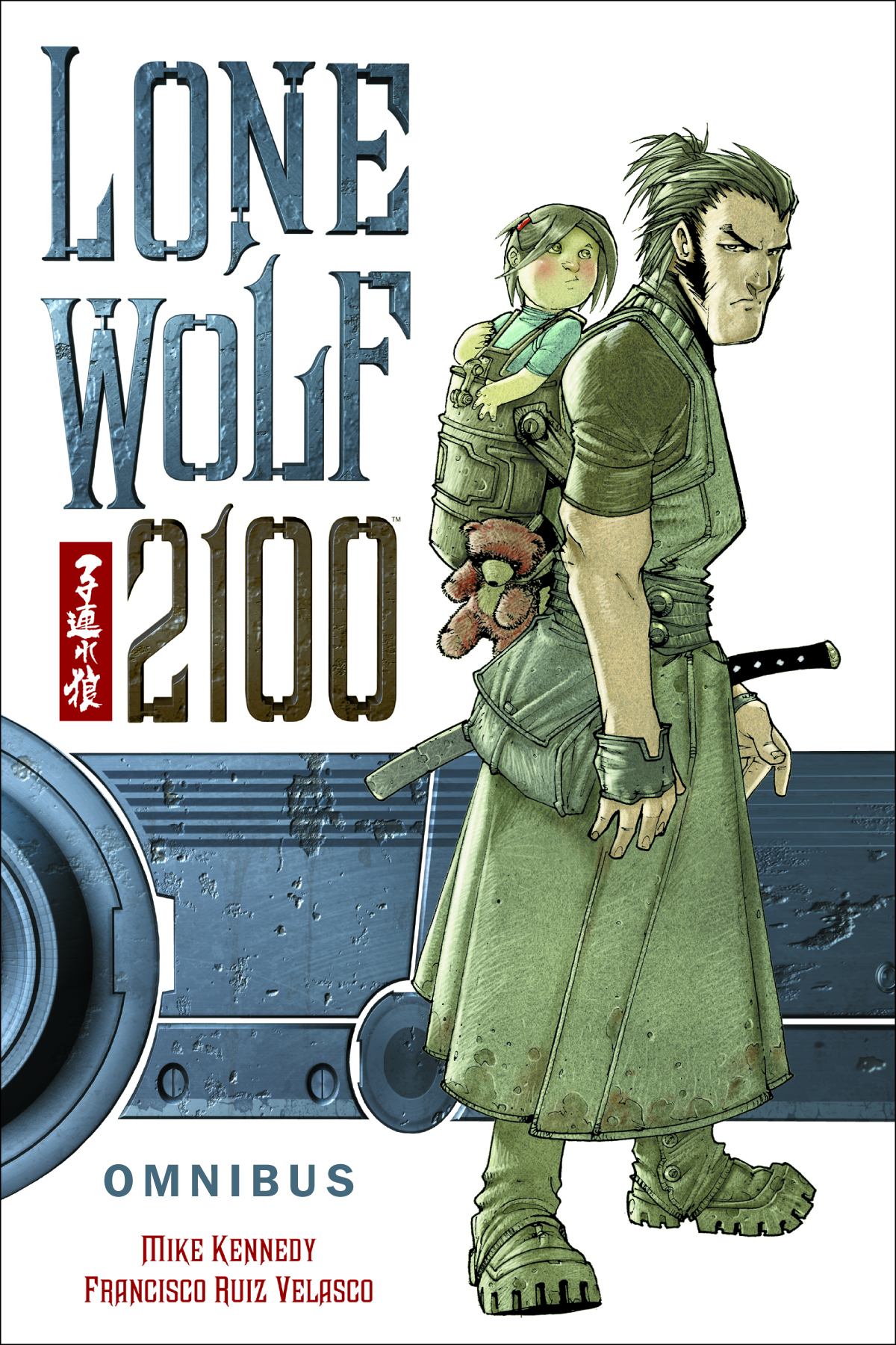
I have to assume that this is based on the Japanese movie series and manga, Lone Wolf And Cub. Anyone familiar with LW&C will know the basic story all ready: travelling samurai has a child with him to he must keep safe while killing people and defending his honor. The 2100 version has the samurai played by an android and the cub, Daisy Ogami, is somehow the salvation of a dying future. Lone Wolf must keep her safe from powerful people who want all for their own. It doesn’t sound terribly original but the Japanese movies were quite entertaining for their time and I’m hoping the new adaptation is as well. Dark Horse is also releasing the original Lone Wolf and Cub in Omnibus editions this month as well for those of us who like to see where something started.
Publisher: Dark Horse
SRP: 24.99
Contains: Lone Wolf 2100 #1-11, Lone Wolf 2100: Red Files #1
Amazon, Indigo: June 11
TFAW, MCS: June 12

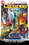
I don’t know. I don’t get it. But this is very popular, so here it is. I read that it was one of the biggest hits in the comic book industry for 2012 and one of the most successful “all-ages†comic books ever. Wow. I watched some of the show and I didn’t get why it was so popular. I doubt
I’ll read the book even though they’re super popular. I just don’t get it. And pickings were slim this month without double dipping into another companies releases and I decided not to do that.
Publisher: Kaboom Comics
SRP: 14.99
Contains: Can’t get exact info, but I did find out it’s two arcs totaling 112 pages
Amazon, Indigo: July 2
TFAW, MCS: June 26