


Brraaakoom! A whole mess of updates, redesigns and tweaked features!
This list is gonna be a lot to get through, but here goes!
Removed the HEADER!!??
This is going to strike a lot of you as very strange, but I’m going for it.
I just don’t think branding is very important! Getting to the content quickly matters more, so I’m removing the giant TRADE READING ORDER banner and everything else in the header. The top of the page is now the navigation bar.
This goes against a lot of web design currently in practice, but with so many people finding this site through google results, stumbleupon, and other social media, getting to the content as quickly as possible without a jumble of unrelated text up top – well, that matters! I’m going to try to keep the site identifiable, but in ways that don’t take up that much space.
It’s funny that without a big old banner up top, it feels like a site isn’t really done – but I’ll get over it.
I moved the Search and the Weekly Giveaways from the header to the right sidebar.
Image Alignment
I’ve been told that sometimes images in the reviews bump into the content bar. I’m thinking this means that they are aligning with the above floated images because the review text isn’t always displaying the same?
In any case, I’ve started using “clear” tags to clear the float value and make sure the images align correctly (should help in the feed too!)
And I got a plugin to add some buttons to the visual editor to make that a little easier on myself.
Misc Pixel Fix
Fixed that one pixel of black at the bottom (this had to do with a border on the hidden wpstats image. oops!)
Home Page Tweaks
I’ve gotten rid of some of the extra vertical spacing between the tables featuring different stuff on the home page. Ideally you won’t really even notice this, but the space is used more efficiently now.
I fixed a padding issue that was causing the blog and featured content segments to extend ten pixels to the right of their ideal position, moving them out of alignment with the rest of the content and into the sidebar.
Then, I changed the alignment of the text under the featured content thumbnails, so it’s more condensed and centered, but then decided to move it all to the sidebar.
Blog has been given the same amount of text space as single post pages, and given some breathing room.
Blog and Essay Headers
First I added the category filing information (such as | Filed in Blog > Essays | ) to the Essay header. I also added the date information.
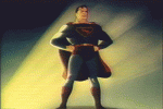
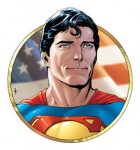
Then I made this layout the default for all blog posts, making the titles smaller, removing the image (which I still love and will use again) of Superman super-typing, and generally condensing the header space.
This means much more room for content. The title of the post is smaller, but not as crowded by other elements. If you’re coming to a review page, or a reading order, for example and it’s your first visit to the site, more of the information and images will be above the fold – making it easier for you to find what you’re looking for, I’d hope.
Reading Orders
Headers no longer have a fixed height, and will now fit whatever information (or lack of information) is contained. It’s possible that there are still a couple categories that need this fix, but I’ll keep my eye out for it.
Book entries no longer have the class “post” but “database-entry” – as of right now the only formatting difference is that the dotted line is on top instead of under the post.
Blog Categories
News, Interviews, and Features has been split into News, Interviews, and Features. Er, but separate now.
I’ll be going through and redistributing the posts from the combined category tonight, and they should all be in the proper place by the morning.
Interviews and Features have been added to the top navigation and the sidebar.
Interior Page + Home Page Sidebars
I moved “TPB Reading Order” to the top of the first sidebar, and changed it to “Trade Reading Order”
I changed the letter styling so “Trade Reading Order” fits on one line.
I made it so this Trade Reading Order title has an H1 tag instead of H2, since it’s basically now our header. (Honestly, getting rid of that big text up there might be bad for search engine optimization – because people should be finding this site when looking for reading orders! But you know what? Search engines should be smarter than that now.)
I removed a margin so it’s more aligned with any reading order list title (higher up)
Increased the right sidebar width by 10 pixels and took away some padding.
Fixed an issue with the sidebar login widget which was causing it to be indented down – it’s now aligned correctly.
Tightened up the Blog listing with some slashes to save a couple lines of space.
Switched a LOT of widgets around to allow for the exterior sidebar to be the same on every page, including the home page.
Added a “Select Reading Order” dropdown to the top under the search box.
Added an “Edition” tag listing dropdown.
The interior sidebar is now set up to be dynamic based on the content being viewed. (IE Marvel characters on a marvel page, dc characters on a dc page, etc. It’s not set up yet, but will work like that eventually.)
Forum
I’ve tightened up the forum (basically matches the home page) and added our new main sidebar.
Upcoming Features Page
I’ve updated and crossed off/deleted some items on the Upcoming Features Page.
Top Navigation
Added an Archive link to blog (it’s the same destination as the top blog link, but I think some people won’t realize that the top hover is also clickable.)
Changed “Home” to “TRO Home”
Moved the whole text over just a couple pixels to fix alignment.
Moved header out of the wrap so it’s now on top of the content. This makes it so the dropdown menus don’t have to obey the content rules (and User CP shows up over the side)
Footer
Finally – I’ve added a footer.
With the loss of the header and all these other structural changes, it seemed a ripe time to put something at the bottom.
It’s the same footer from the forum page for now, but eventually I’ll add more navigation into it.
That’s it for this post!
I’m sure there will be more in the next day or so, especially minor tweaks finishing up stuff I’ve messed around with tonight.
As always, let me know if you see anything out of place!


put that header back in. It’s like a comic with a title! It looks clean, pristine, and I know that I’m at the right site!
-M
[Reply]
That was my original thought, but it took up space of half of a large image. The problem I was running into is that for people first getting here, it takes up too much of their screen.
I’m thinking of trying to work something in on the left side now.
[Reply]
hmm, i understand that problem. Perhaps something in the left column will work to. Just a small image/title to let people know where they are.
[Reply]
I was thinking of putting it right outside of the border on the left, so not a full column. Kind of it’s own little badge area.
For now, we’ve got the domain, the title bar, TRO in the header, Welcome to TradeReadingOrder.com on the front page, and “Trade Reading Order” on the top of the sidebar on every page. Hopefully it works for now.
I think part of the decision is that since people don’t even use bookmarks as much as social bookmarking nowadays (I only use bookmarks to keep links to two specific analytics pages), the content is more important than the site serving it. So if the first thing they see is a title that says “Review: Buffy Comic Vol whatever” and that’s exactly what they are searching for, they may be more satisfied.
Real fans will probably be subscribed to the feed anyway.
[Reply]
It’s hard to find well-informed people on this topic, however, you seem like you know what
you’re talking about! Thanks
[Reply]
Admiring the hard work you put into your site and in depth information you provide.
It’s awesome to come across a blog every once in a while that isn’t the same old rehashed
information. Excellent read! I’ve bookmarked your site and I’m
adding your RSS feeds to my Google account.
[Reply]